Hello there!!
I think I rarely dedicate myself to doing only faces, faces and more faces. Of the faces I've done in the past, I had never done one so close-up - I made one with charcoal that is my pfp, but that's not digital, and I didn't put as much detail there - so why not give it a try?
Creating a face up close often means that, many times, creating a complete drawing takes less time than a portrait. Well, that depends on what the artist wants to do because if they're doing something very, very realistic or hyper-realistic, oh , that takes an eternity, but the result is incredible. Since I'm not very good at portraits, it took me some time, but not that much.

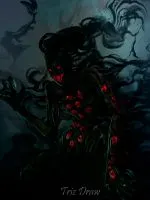
In this face, I wanted to try some different things, like quite prominent shadow and lighting. I think I've only done that a couple of times before. I like that combination; it's like what hides in the shadows. I added some details to the girl's face. My favorite part of this drawing was the lips- in fact, without the shadow, I like them more. Do they look plumper?-

 |  |
|---|
I started this drawing in Corel and after having chosen a canvas, which I don't remember now, with a chalk brush I made several strokes with the color I selected to make a base -If that can be called that- It wasn't perfect but it worked.
With some darker tones I made some shadows to give some shape to the stain I had previously, more than all in very specific places that would provide that "simple" definition, the face still had to be improved but it was on the right path. Just missing more details 🤔
 |  |
|---|
Since I still didn't have the girl's face very well structured, I went into giving a little more detail and making the eyes, mouth, nose and so on, that would give me more information about what I was doing,and what I needed to do next, what was a big stain now looks better, things still to do.
As things were getting better, I started detailing them a bit more. The brushstrokes were a bit more blended and softened. When I began, everything had a reddish tone, so I started adding other colors to have a bit more richness, as, to be honest, the skin reflects many colors.
 |  |
|---|
As I progressed, the face became more detailed, although it still needed some cleaning and improvement in certain specific areas for better definition. I stopped working on the face and focused on the shadow and light that it would have. So, I switched to Photoshop and finished the work there since I have mixed feelings about Corel's blending modes.
After doing several things, adding lighting, a light bounce, more shadows, and some other things like the shadows of what would be some leaves or branches, I left it like that since it seemed decent to me, and I returned to focusing on the girl's face.

A few important things were still missing to finish this portrait, so after finally completing the lighting – but I thought about this step quite a bit since it wouldn't be like other occasions where I could simply draw over it – well, here I could too, but the shadow was all over the face. So, in a way, when I had that confidence, yes, it's fine like this, I left everything in one layer and worked on a layer above to further detail things and add what was missing to complete it.

Thank you very much for taking the time to view my work.
👉🏼👈🏼


𝕺𝖍𝖍𝖍 BTW
👈🏼😶😶👉🏼
𝕱𝖔𝖑𝖑𝖔𝖜 𝖒𝖊𝖎𝖋 𝖚 𝖜𝖆𝖓𝖙
👇🏼