Hello there!!
Inspired by the Christmas season
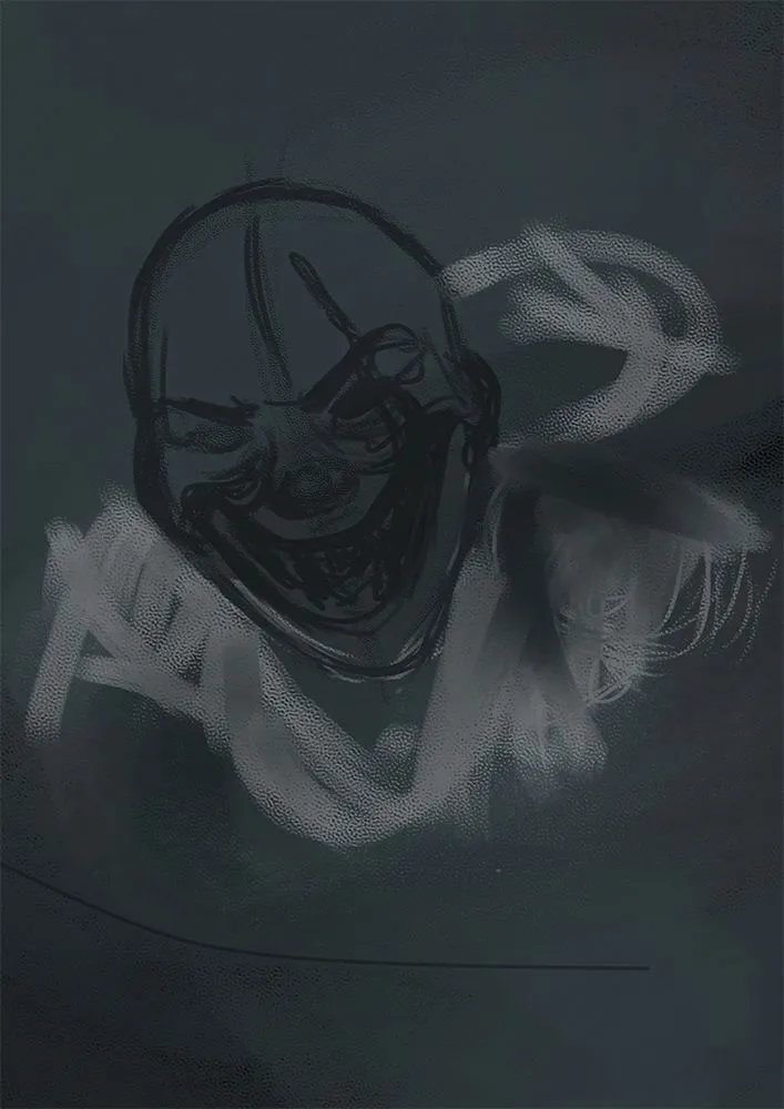
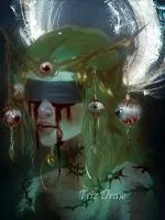
Why not? A dark twist on the figure of Santa Claus. I wanted to try an evil version with haggard features, piercing eyes and a sinister aura. Pure malevolence. The gift sack reveals unexpected and disturbing presents. This is an unconventional Christmas Santa, aiming for something a bit darker, the shadowy side of the holiday season.
On second , the truth is that doing his job is not an easy task, everything in a single night and with so many schedules must be something complicated. The idea wasn't to create Krampus or the Grinch, which would be the opposite, but rather the most worn-out, evil version of Santa.

Usually, Santa Claus is associated with generosity and Christmas joy. But in this slightly contrasting version, those good things are not present. I wanted to add some small elements to accompany this drawing. I didn't want it to be a creature, but rather something worn out. I started this drawing in Corel and finished it in Photoshop, going from dark to light, which is a bit contrary to what I usually do. But I have done it on several occasions, and it works for me.
 |  |
|---|
I was going to make a sketch, and this is as far as I got. Well, I had a bit of what would be the structure of the face; that worked for the rest. I had been trying out some canvas types and brushes, and when I did the sketch today, it turned out with those colors. Well, shades of gray, if you can put it that way.
Following the sketch, I started making some strokes with the brush, selecting different tones to add shadows and highlights, also to shape the figure a bit and finalize the pose.
 |  |
|---|
What I had previously, despite being a base, I wanted to start drawing from the darkness. I've done it a couple of times, and it seems very effective to me. The only thing I did to darken it was to place a solid color on a layer above and set it to "Gel" mode. It seems that the blending modes in Corel are a bit different, even if they have the same name, they give a different effect.
Now that it was darker, it was time to gradually detail and add more volume to what I had. I shaped the face and Santa Claus's beard a bit.
 |  |
|---|
Little by little, I was shaping the figure of Santa better. There were some more detailed aspects. When everything was dark, I started adding the lighter colors, and that's how I also added brightness. Although Santa still looked quite dark, there was a lot left to do. On the back, there would be a bag, though not filled with gifts.
Adding more colors and details to what I already had. Also, Santa's sack arrived, which comes with some unconventional gifts. I wanted it to look quite weathered; typically, Santa looks a bit more robust.

To finish, there were a few details left to address, in addition to adding a bit of snow to give it the missing Christmas touch. Something was missing on the teeth, so I worked on that a bit. After adjusting some colors, everything was ready.
Thanks to everyone for watching my post
Until next time!!!
Thank you very much for taking the time to view my work.


𝕺𝖍𝖍𝖍 𝕭𝕿𝖂
𝕱𝖔𝖑𝖑𝖔𝖜 𝖒𝖊 𝖎𝖋 𝖞𝖔𝖚 𝖜𝖆𝖓𝖙