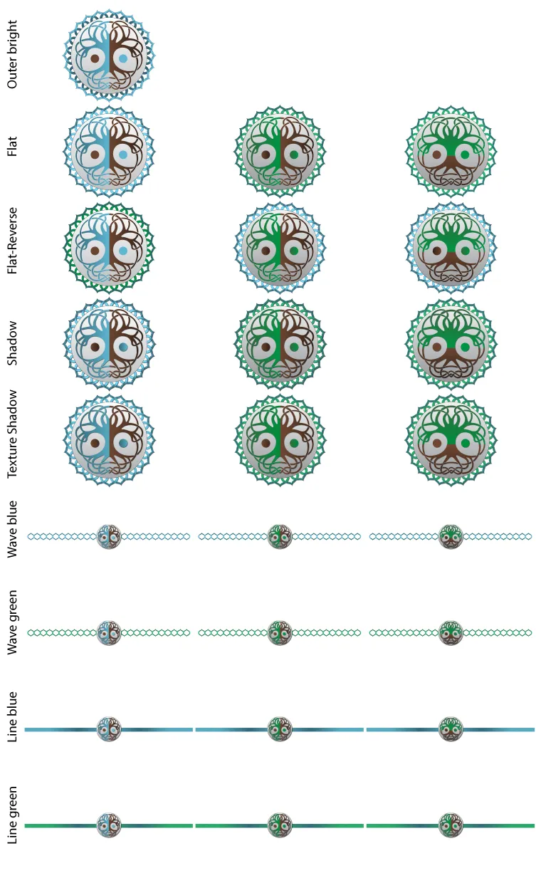
I have made a logo, separator and banner design for the Abundance Tribe logo contest. There is a blue and green version. Blue is my favorite color, so I just had to design a mostly blue one. The green one is probably more representative of the principles of the community though.
(Right-click "Save image as" to open in better detail)
Entries
Green version:


Blue version:


Tree-colored version


Meaning of Symbolic Elements
The tree is the main symbol. The tree is part of the Earth, a plant connected to the ground, firm, steadfast, stable, and immovable, much like the rights of the individual. The tree also looks like a face, showing the animal/human side at the same time. This also symbolizes the relationship of the Earth, plants and animals/humans in cooperation.
Further, balance and harmony are exemplified as the tree is separated with the circles accentuating this symbolism of the yin/yang, again symbolizing relationships, harmony and balance.
The tree is encapsulated in the timeless infinite circle, associating all the individual components into a larger collective harmony, like the Earth.
The outer portion has lotus petals as another layer of encapsulation, uniting with each other to protect and preserve the integrity and harmony of the system within.
The green to symbolize life, nature, environment, plants, energy, harmony, balance. The brown to symbolize earth, wood, solid, reality, existence, grounding/stability. The blue to symbolize truth, wisdom, loyalty, trust, stability, peace, tranquility.
Here is a collage with some slight variations (right-click "Save link as" to open in better detail if using peakd which doesn't open images larger):

Let me know what you think ;) Peace.