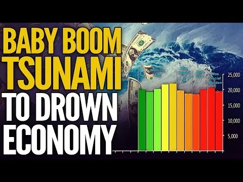
In this video Mike Maloney uses an animated graphical chart to visualize the baby boom tsunami and what this change in demographics will mean for markets. This video is a follow-up to Mike's previous (28 March 2017) video on the Baby Boom generation which is also linked in this post.
7 minute video from GoldSilver (w/Mike Maloney) published 11 April 2018

7 minute video from GoldSilver (w/Mike Maloney) published 28 March 2018

I am not affiliated with Mike Maloney. I am a subscriber to the GoldSilver (w/Mike Maloney) YouTube channel.