

We are pleased to announce the winners of the Curie Logo Design Contest
First a big thank you to everyone who entered, as well as everyone who participated by voting and commenting on the entries. There were so many entries that narrowing it down to a field of finalists was a difficult task. Community input was sought in the form of upvotes on the comment entries into the contest, and all top vote getters (by number of votes) were included in the field of finalists. In addition, Curie curators, reviewers and operators discussed internally and nominated some entries that may have come late to the contest and did not have the number of votes, but were still considered to be quality entrants.
View the finalists
Curie curators, reviewers and operators voted on the field of finalists. Voting methodology was weighted top 3 with all voters selecting top 3 entries: 1st place (3 points); 2nd place (2 points); 3rd place (1 point).
Second Runner Up: @ufxpression

I am really excited about the opportunity Designers on this platform are given to express their artistic skill and to emanate a new Logo based on the ideology Curie as a community was formed on.
Taking a look at the community itself, which happens to be a community that rewards people for creating engaging and Original Posts I believed making emphasis on what the community does for the platform is important , so I came up with a "C" and an Upvote button"^".(source: @ufxpression's contest entry post)
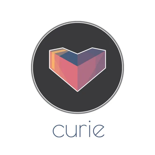
First Runner Up: @skippyza

I don't know if anyone else reading this has ever been "hit" by a curie (I'm sure you have), but it must have been one of my favorite experiences on Steemit thus far. The experience of being recognized by curie is only really trumped by all the people I have met through Steemit. So thank you @curie, for making Steemit a better place!
The Shape: At first you might see a heart, or perhaps a 3D "V" shaped box. So what is it really all about? Well, imagine for a second the upvote button was a 3D object, and fell over (right on it's face), you would end up with something like this. Of course the fact that it then forms the heart shape was also intentional, and I thought sharing some love was a good way of describing @curie as a service and a community.(source: @skippyza's contest entry post
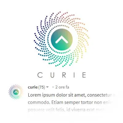
Winner: @overdye

Representing concepts such "meritocracy" and "discovery" do not fall under the canons of traditional design. Not really. This is why I took the opportunity, as a unique opportunity.The canons that I imposed for this realization had to be:
- Meritocracy
- Community
- Joy
The points, in a community context, finally become people, energy, joy and life.(source: @overdye's post explaining the design process)Well yes, joy finally. The very reason to exist for any community.
Despite the "venal" meanings that I feel to attribute to steemit, I feel I have found in Curie a community in search of an authentic values. Made of good contents, of people who celebrate life and human beings every day. Is this the same sense of modern "currency" in actual and future living?
Joy?Absolutely yes.
They are.Let's make it joyful.
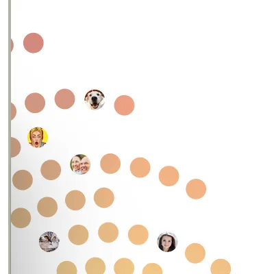
Another point that led me to dwell on this solution was usability. For a good brand to be effective, I make sure that this can be used in a creative and fun way without diminishing the essence, indeed, trying to understand how the essence of the logo can be enhanced and brought to new levels. This is why I created a series of ready-to-use graphic elements:
Blog Messaging
Power Signature


Blog Elements

For those new to Curie, please follow @curie, and join us on Discord: https://discord.gg/jQtWbfj
Follow @curie's votes to support the authors. Please consider following our trail and voting for curated authors. If you are a SteemAuto user, @curie is an available trail to follow.